Is it really as expensive as people say it is to buy property in Toronto?
Unless you’ve been living under a rock the past few years, you’ve probably heard that Toronto real estate prices are through the roof – but just how through the roof? We keep hearing the magic number of $1.2M, but is the whole city as expensive as every real estate agent wants us to believe? Should millennials pack up their man buns and skinny jeans and move to Montreal?
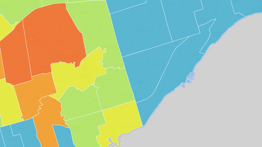
Long story short, no. The city is still outrageously expensive and prices are still appreciating at an unstable pace. However, some neighborhoods have an average property price of $400k while others are closer to $1.6M. We spent hours (more like days), pouring over the data with our analysts and made some interesting observations, we thought we would share in the form of a chart, but that was lame – so here’s a map!
About The Map
What Does The Data Show?
Distribution is the largest factor in pricing. Don Valley West, that contains low density (and extremely pricey) neighborhoods like Hogg’s Hollow and the Bridle Path, topped the scale with an average price of just under $1.6M – which skews the numbers for the rest of the city. To be honest, most people have never entertained the idea of living in one of the world’s most prestigious neighborhoods (myself included), so why would I factor that pricing into the house I’m looking for?
Another surprise for us was that downtown Toronto was not one of the more expensive neighborhoods, instead the density and smaller houses resulted in a lower average price. Scarborough despite being almost a third of the city has no neighborhoods that have an average price above $600,000, and ditto for along the Humber River in the West End. What this means is the majority of the city is actually filled with property that does not warrant the bidding wars we keep hearing about.
Neighborhoods
Have you ever noticed that a real estate map has boundaries you’ve never seen before? That’s because the Toronto Real Estate Board (TREB) uses its own system that’s very different from the wards you might recognize on an official map. There’s nothing wrong with that, but an interesting thing happens when you look at data in a different way – trends and numbers that were previously very apparent by the people presenting them becomes not so clear…or sometimes they become crystal clear.
So we took the same data and re-projected it onto a standard, low-bias, official city of Toronto map. This is why our numbers might look different from the numbers agents will quote you, they’re both right in our opinion. Just explained with different biases – so chose the numbers you want to believe. Just remember, we don’t make a commission if you buy or sell your house either way.
How Did You Get Those Prices?
We used the TREB composite prices, which are averages made from every type of residential property sale – houses, townhouses, condos, etc.
Price data sourced from the Toronto Real Estate Board.

That line that divides Scarborough. Awks.
Couldn’t you make the colors just a little opaque so that we can see the street names? Unless you know the city really well your map is difficult for the average person to use.
Thanks for the suggestion Ron! I’ll let the UX designer know for the next map we do.